Data Analysis using Python
Before getting started with Data analysis we will get to know a little about Jupyter Notebook and Google colab.
Jupyter Notebook is a web-based interactive computing platform that combines computer code, plain language descriptions, data, rich visualizations like 3D models, charts, graphs and figures, and interactive controls.
Google Colab is a hosted Jupyter Notebook service that requires no setup to use and provides free access to computing resources, including GPUs and TPUs. Colab is especially well suited to machine learning, data science, and education.
For this exercise we will be using Google Colab.
The data we are going to analyze is the CBSE Class-X Result Data. This dataset contains information related to CBSE Class-X results for schools in the different regions. Below is a sample from the dataset. This sample contains details of the number of students Registered(Regd.), Appeared(Appd.) and cleared(Pass) the exam from Region Ajmer based on school categories as GOVT, GOVT AIDED, INDEPENDENT, JNV, KV, and CTSA (Central Tibetan School Administration).
Region	Status	CTSA	GOVT	GOVT AIDED	INDEPENDENT	JNV	KV
Ajmer	Regd.	0	8537	0	          102253	4945	9194
Ajmer	Appd.	0	8509	0	          101822	4928	9160
Ajmer	Pass	0	8154	0	          100178	4911	8875
To get started lets create a new notebook in the Google Colab(https://colab.google/) and load the dataset file.
We will use Python pandas library to read the csv file and display the first three rows of the dataset.

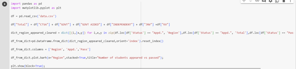
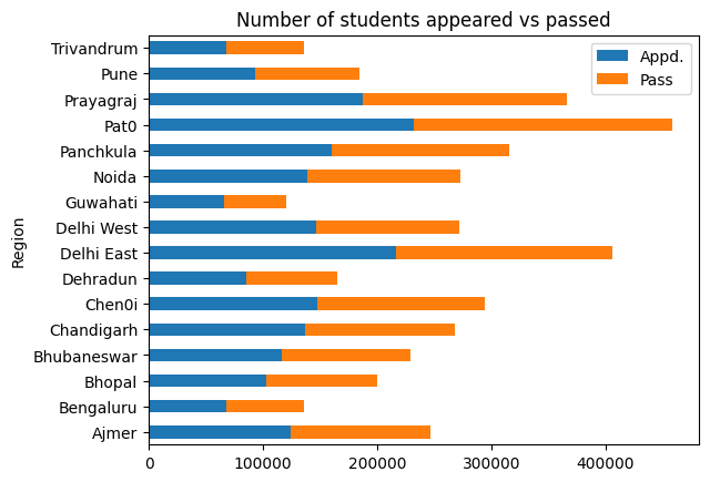
As a next step lets find the total number of students for each status of all school categories combined.

Then we will create a dict with key as Region and total students appeared & passed as values.

We then will convert the above dict to dataframe and use it to plot stacked bar chart.
Finally we will calculate the pass percentage for each region and plot a bar chart to visualize the results.


Leave a Reply